
A stepper component is a highly visible component used in the Amazon Business (AB) journey and is used to show customer's their progress through a set of steps across multiple screens.
Amazon Business' design system, Business User Interface (BUI) did not currently have a stepper component in their design library. This was a heavily desired component for AB UX designers. Because it did not exist, designers were creating their own stepper components or inheriting existing patterns to create stepper workflows. This has lead to an inconsistent experience for customers.
After auditing the current AB steppers for their strengths and weaknesses, I interviewed AB UX designers on their needs for a stepper component. I conducted competitive analysis on stepper components in internal design systems at Amazon as well as external competitor design systems to understand the overall design, usage cases and variants. From there, I drafted a recommendation for a stepper component for the BUI design system for a desktop design and an adaptive mobile design.
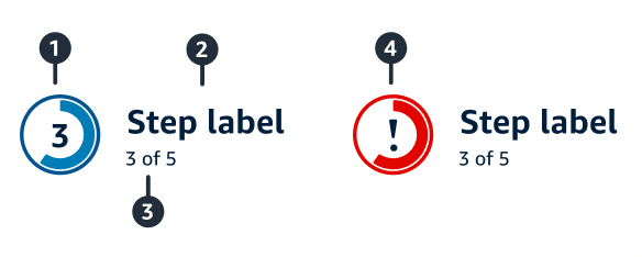
My recommendation for the BUI stepper component was a simple overall design that will have 3 statuses: Completed, Current, and Incomplete. It also has 2 states: Disabled and Error. The component would be static (non-interactive) and follow linear progression using buttons to move between steps. It would have a maximum of 5 steps and a minimum of 3 steps. The desktop design would be horizontal and use circles to represent each step and be placed at the page-level. The mobile design would be adaptive and the customer would view one step at a time. It would include a radial visual track to show progress towards task completion and it would include labelling for the current step and the total number of steps in the stepper.
The stepper component has been the only brand new component added to the BUI design system in the past 8 months, as of the time of my internship, which will have an impact on creating a consistent, predictable experience for Amazon Business customers and impacting at least 3 unique feature-level customer experiences on the Amazon Business website!
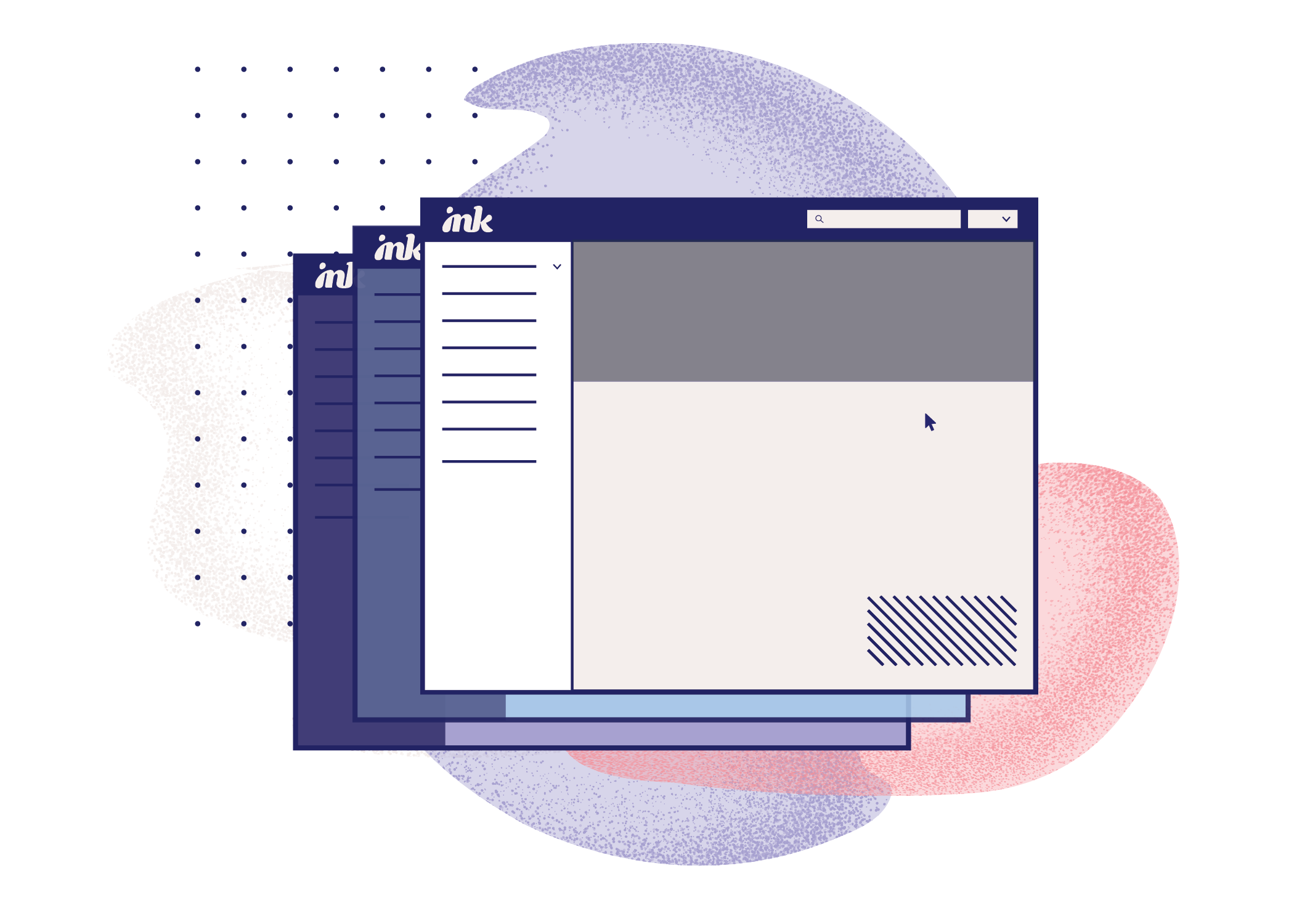
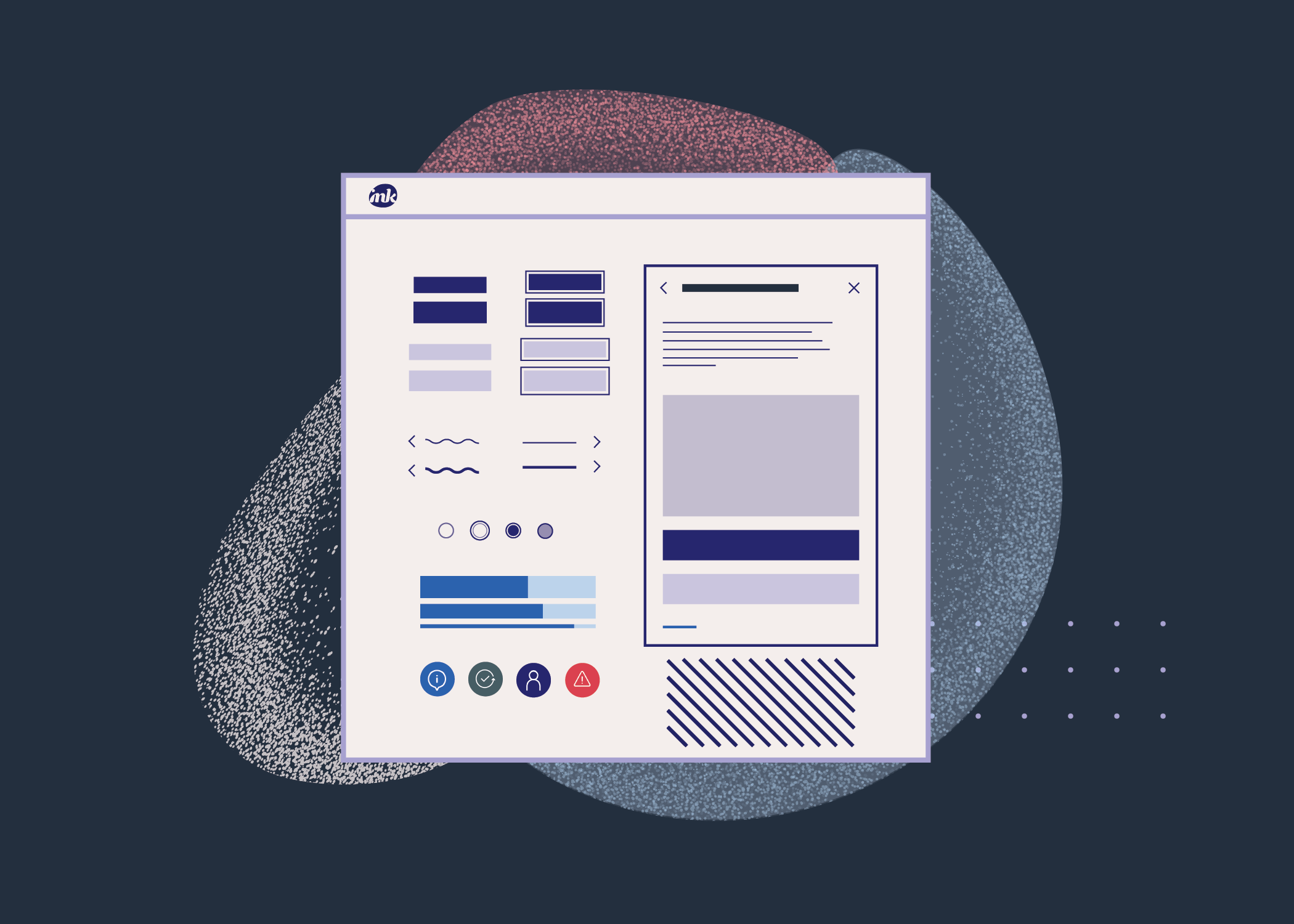
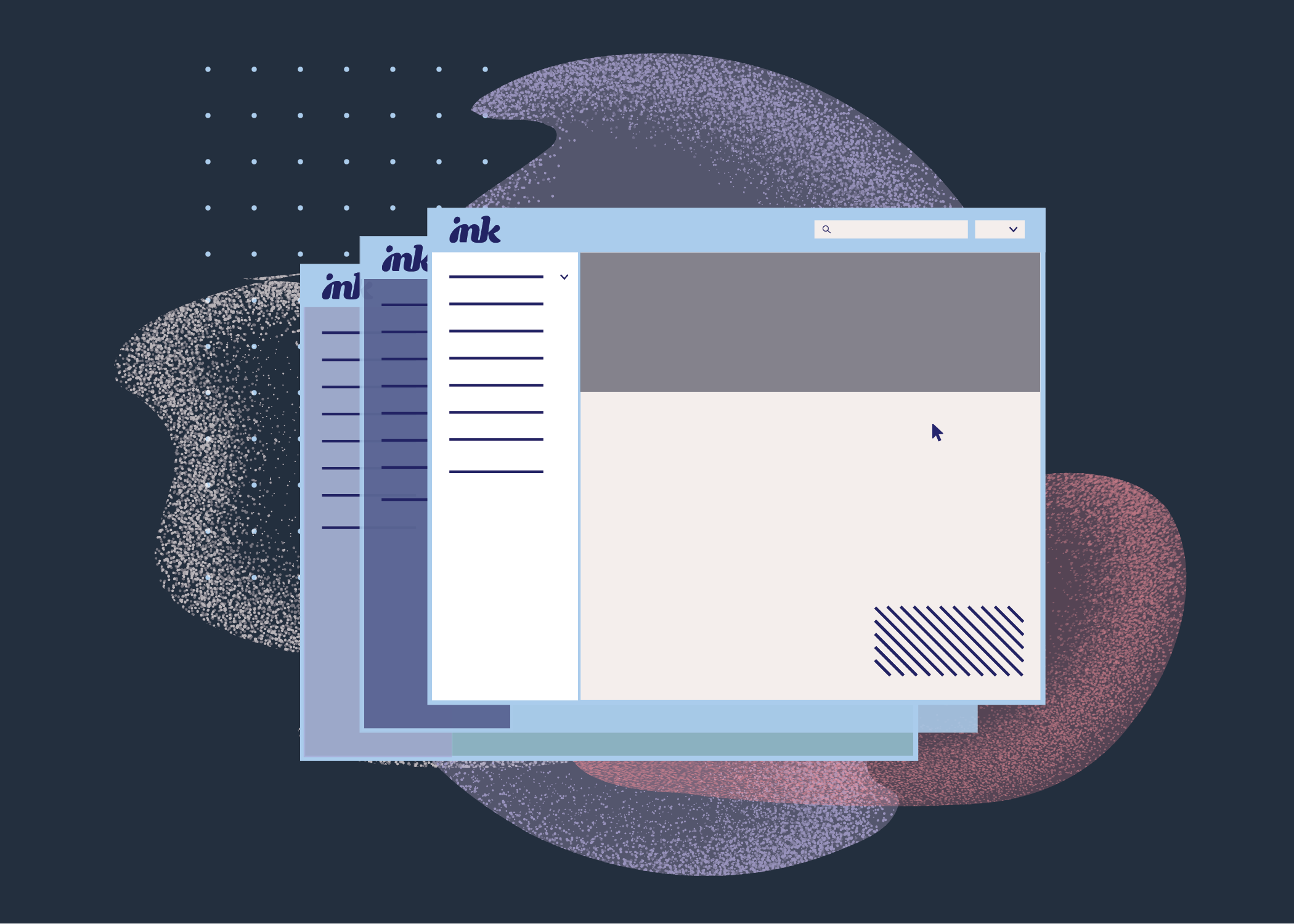
The BUI Design System began the process of rebranding to Ink during my internship. As the new brand was being established, I was tasked with taking over a portion of the brand campaign rollout. This included crafting brand extensions, establishing a brand illustration style, creating illustrations for the new Ink docsite, creating guidelines for illustration design, and designing the new docsite homepage UI for different breakpoints.
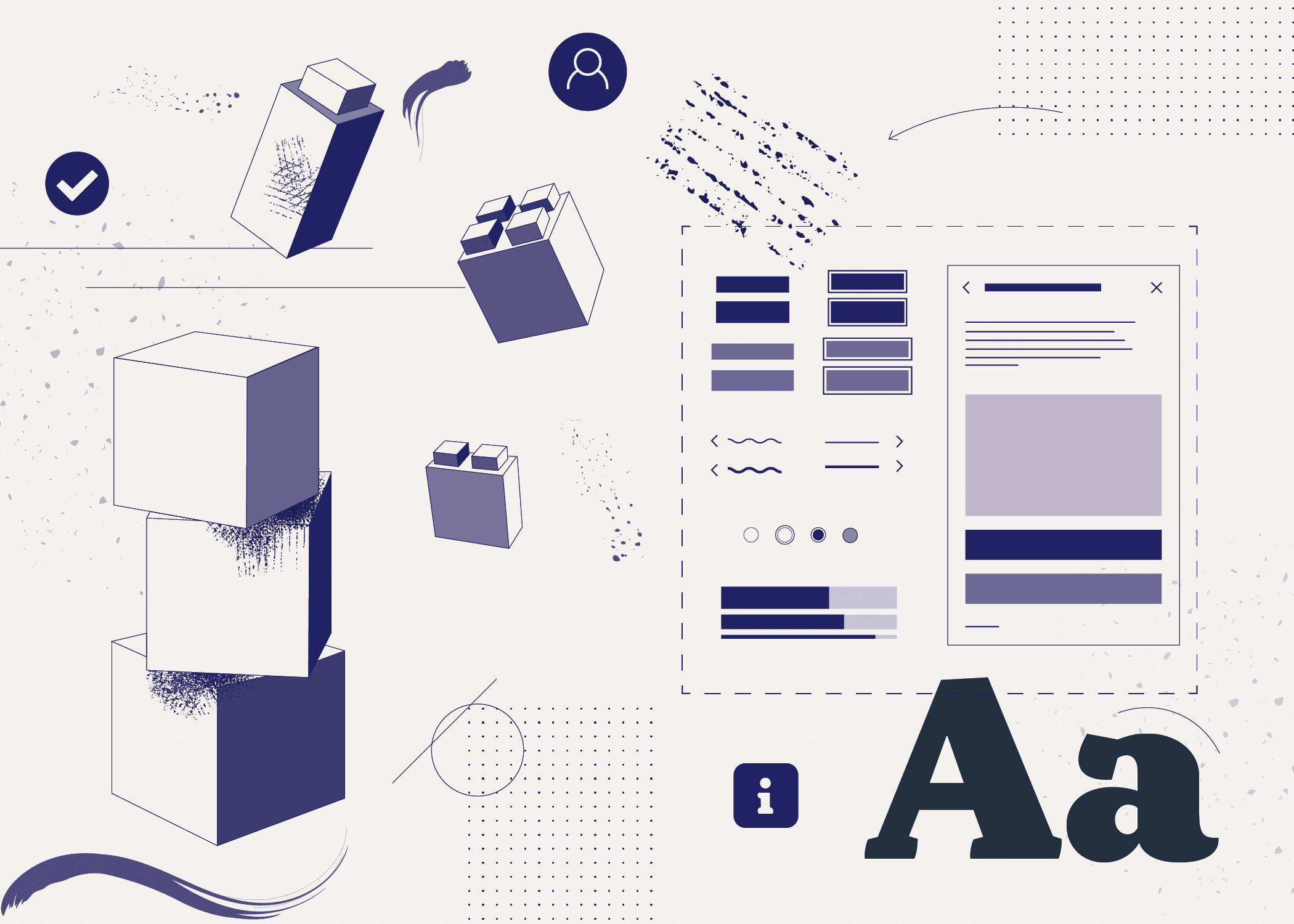
I gathered inspiration from various illustration styles for design systems to begin the process of designing illustrations for the brand. After visual research and creating mood boards, I began crafting illustrations for the docsite homepage content to represent each of these categories: Components, Docsite in progress, Developer start guides and a web banner.
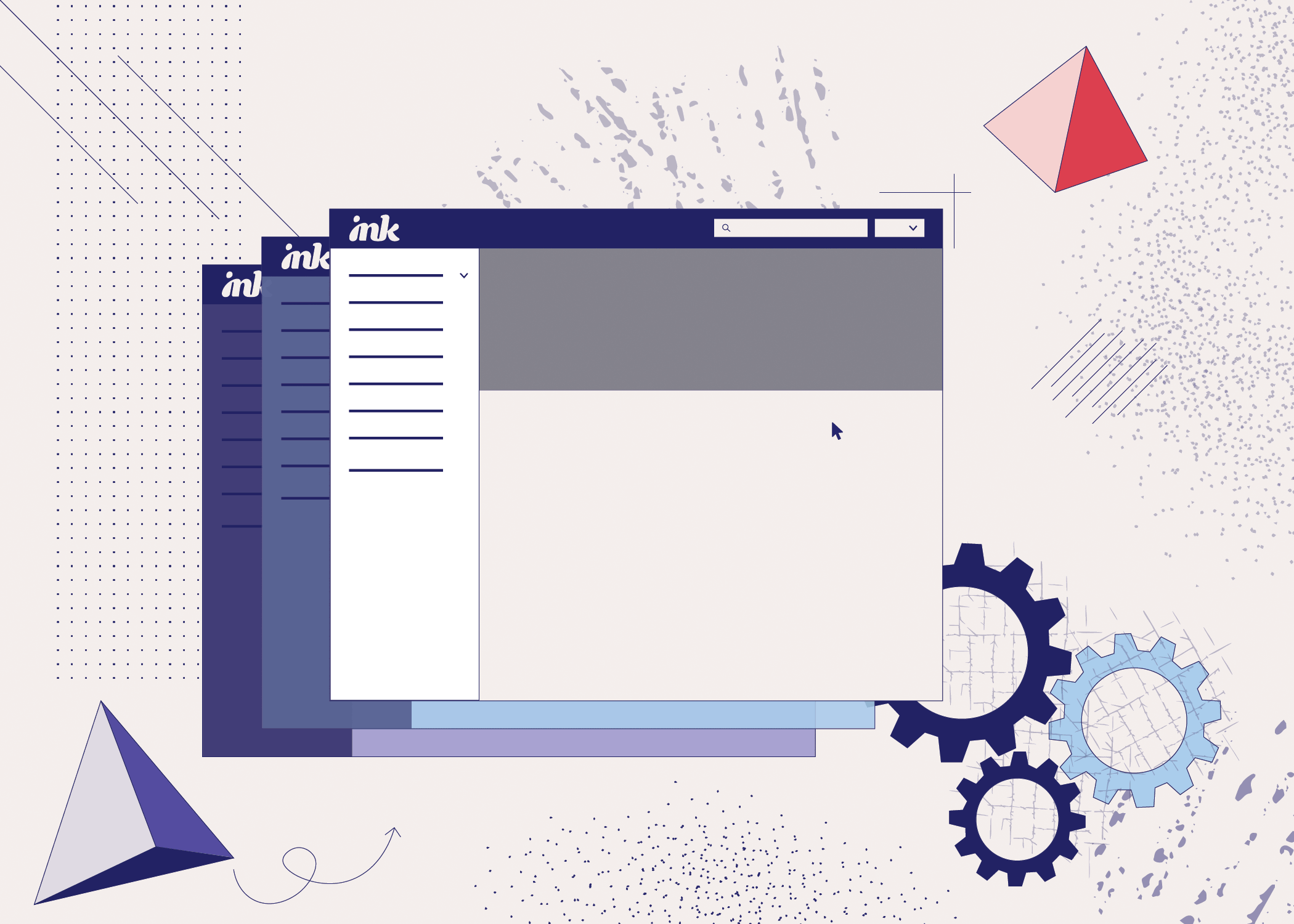

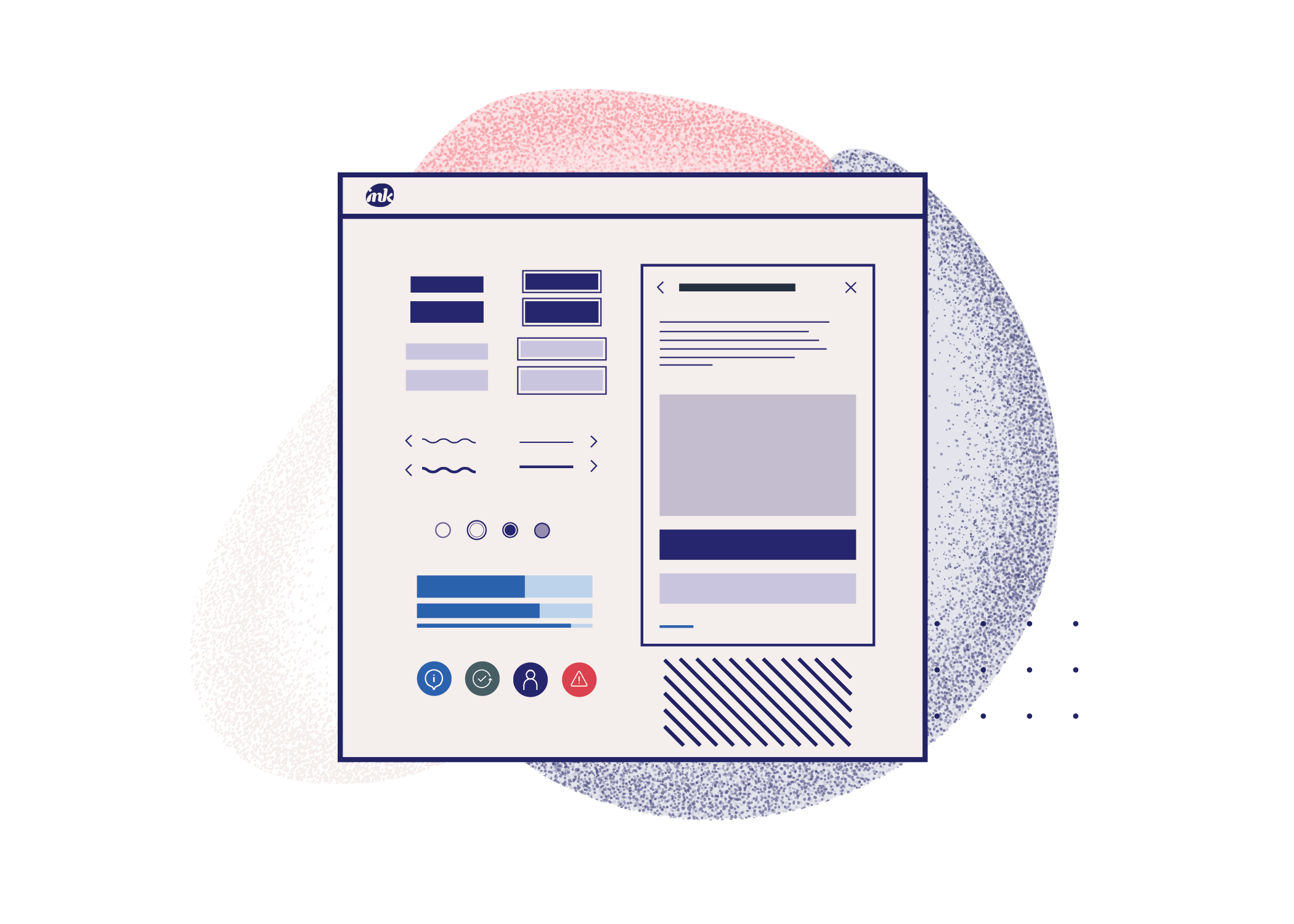


The most significant part of the BUI rebrand to Ink was the relaunch of the docsite for AB UX designers and developers. Using the visuals I designed for brand illustrations, I was tasked with implementing the first version of the docsite homepage UI in the Ink brand.
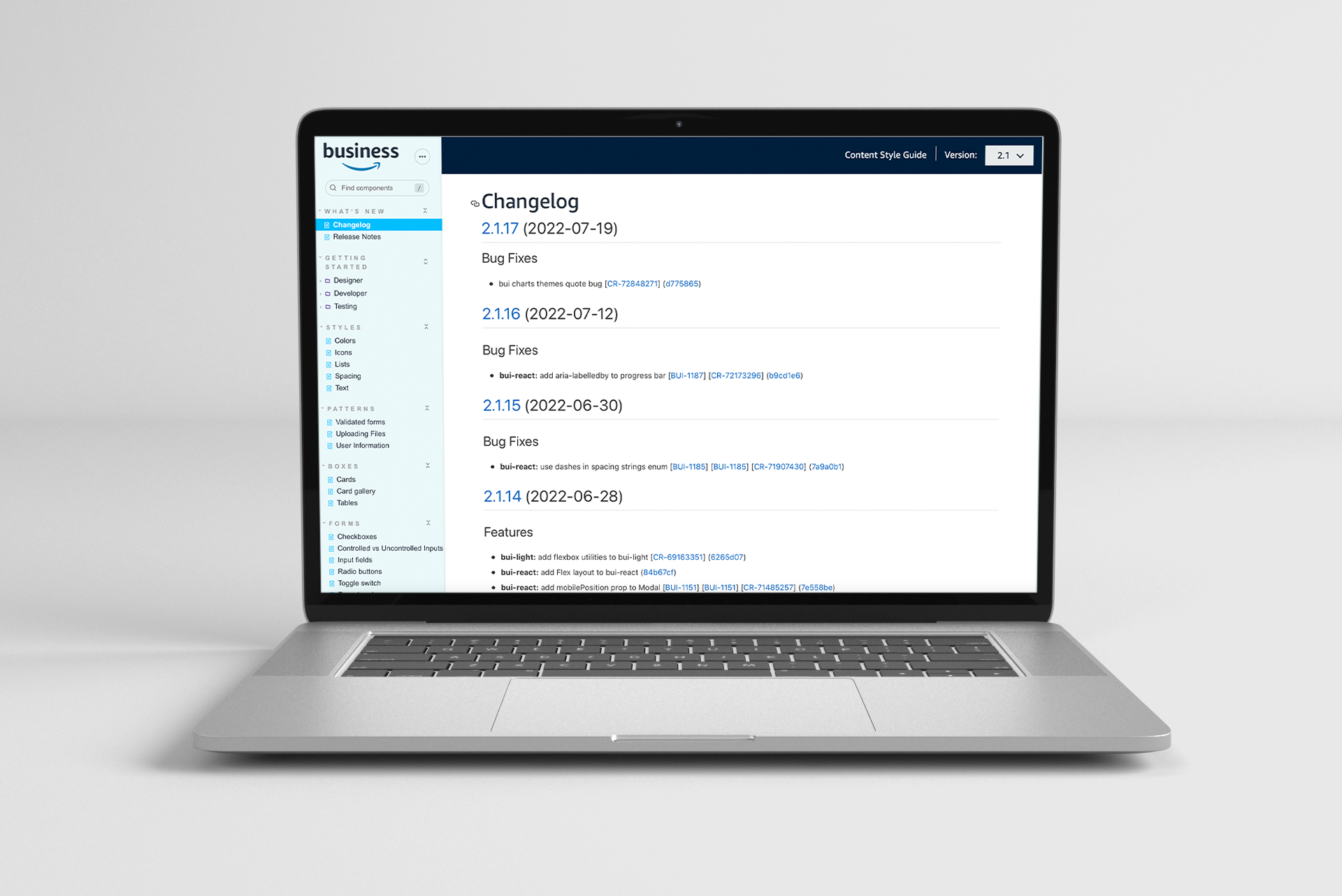
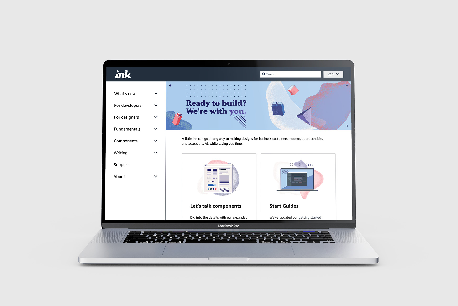
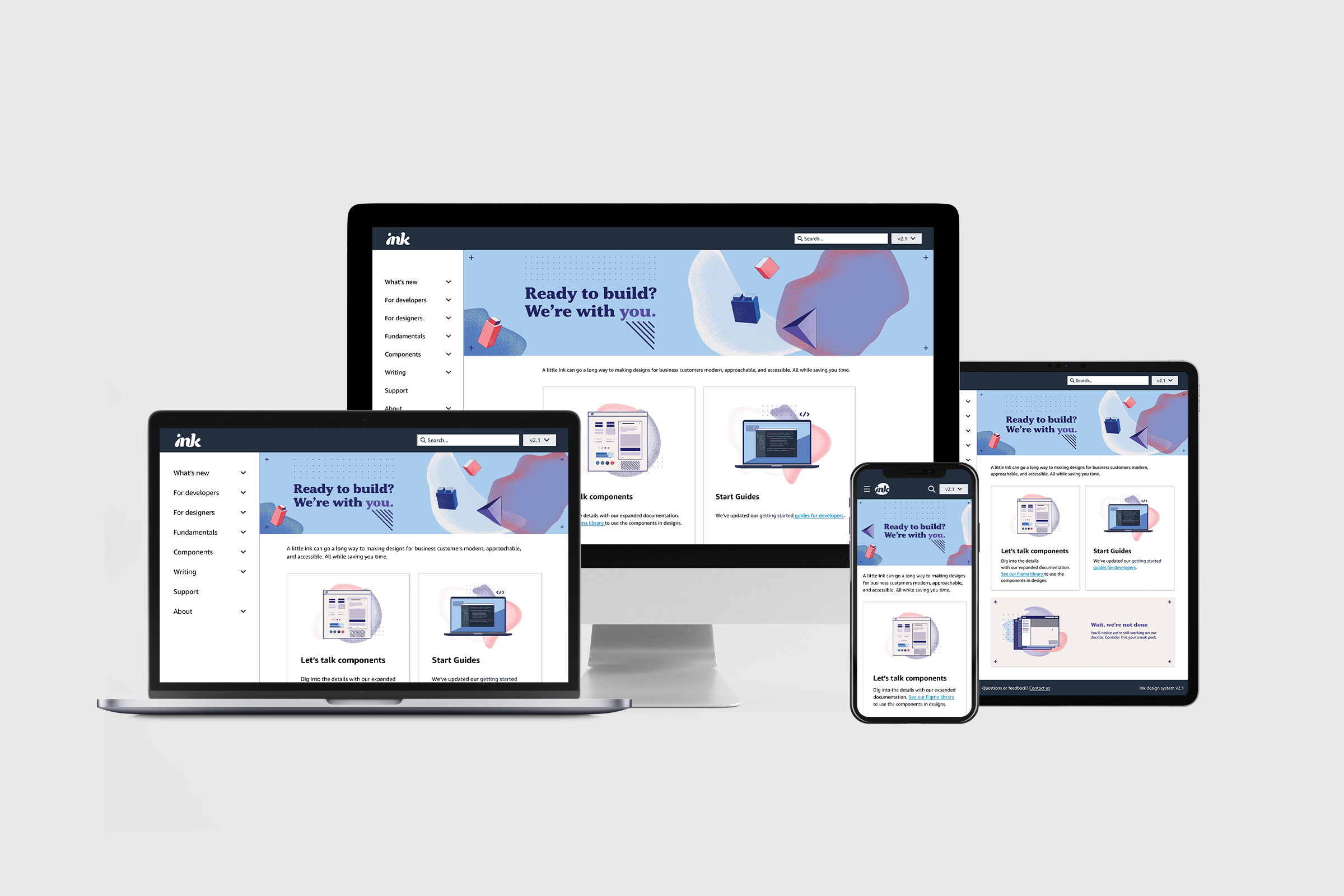
The new Ink docsite will be the first touchpoint for Amazon Business developers who are the primary users of the site at this time. Designing a visually pleasing site with a clear and established brand creates trust between the design system and the designers and developers who rely on solid documentation to build their products for customers.