The current Kindle App is in need of a design refresh. The focus of this redesign was not Amazon’s brand aesthetics, but improving the overall user experience. Currently, the Kindle app has the following problems:
In order to better understand the online book selling market, I researched competitors and similar applications such as:
Based on these services, I recognized the need to prioritize the product covers, ratings, clear pricing, and book descriptions in the interface. Personalization and recommendations in combination with trending products were also important.
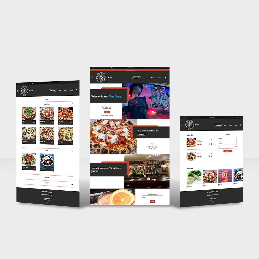
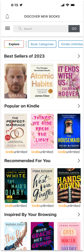
The Discover page under the Kindle tabs is the primary point of searching and ultimately buying a book. The focus of my redesign for this page was chunking and categorizing products in a way that appeared less cluttered. I revamped the page to allow for a more prominent feature of bestsellers and trending books, in combination with personalized recommendations.
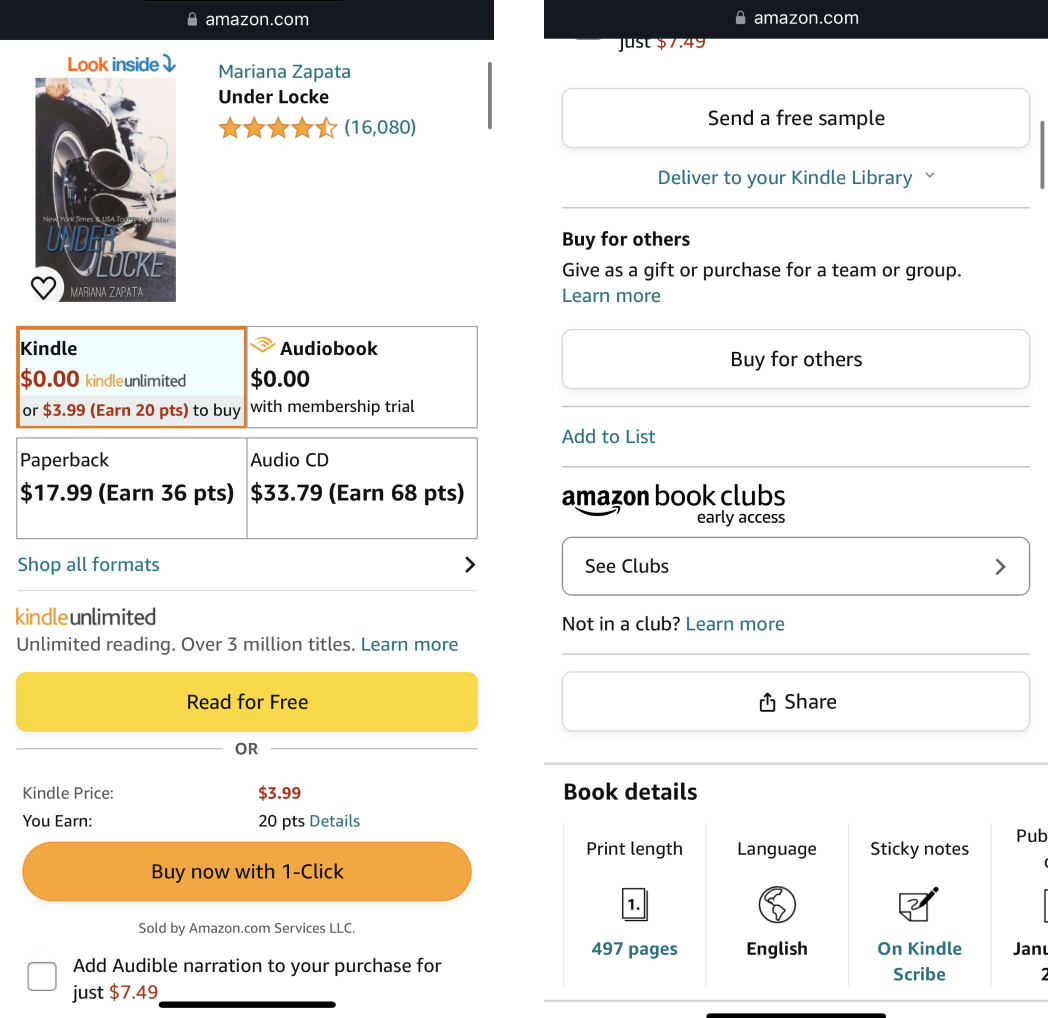
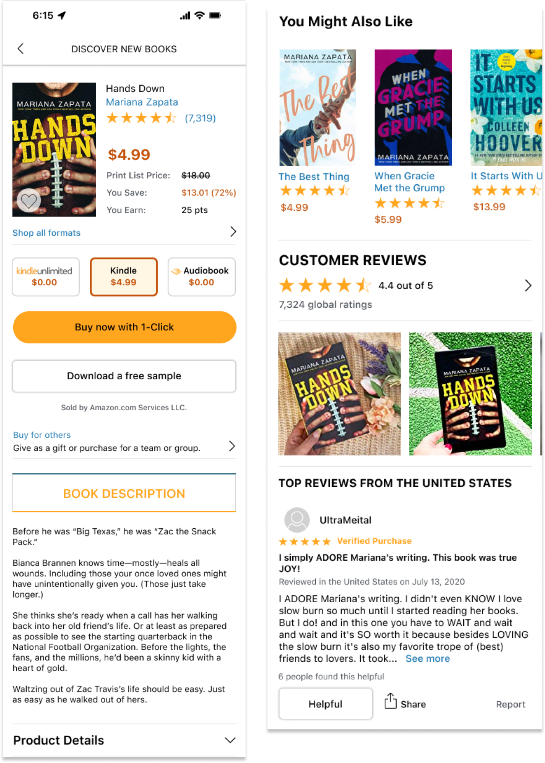
The current purchasing experience for Kindle ebooks is through the Amazon.com website. For my redesign, I integrated purchasing into the product details page under the Discover tab. My focus for this redesign was to reduce the cognitive load of the page and make it easier to see purchasing formats, pricing, book descriptions, and reviews.
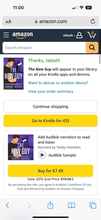
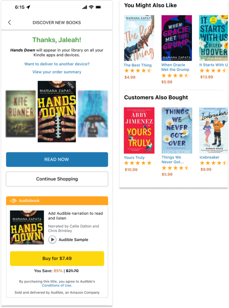
The current order confirmation page has confusing visual signals for the user. My intention with redesigning this page was to bring the product cover front and center as it appears in the library and use varying colors to signal elements such as read now, audiobook purchasing, and shopping buttons. I also reduced the amount of cross-selling on the bottom of the page.