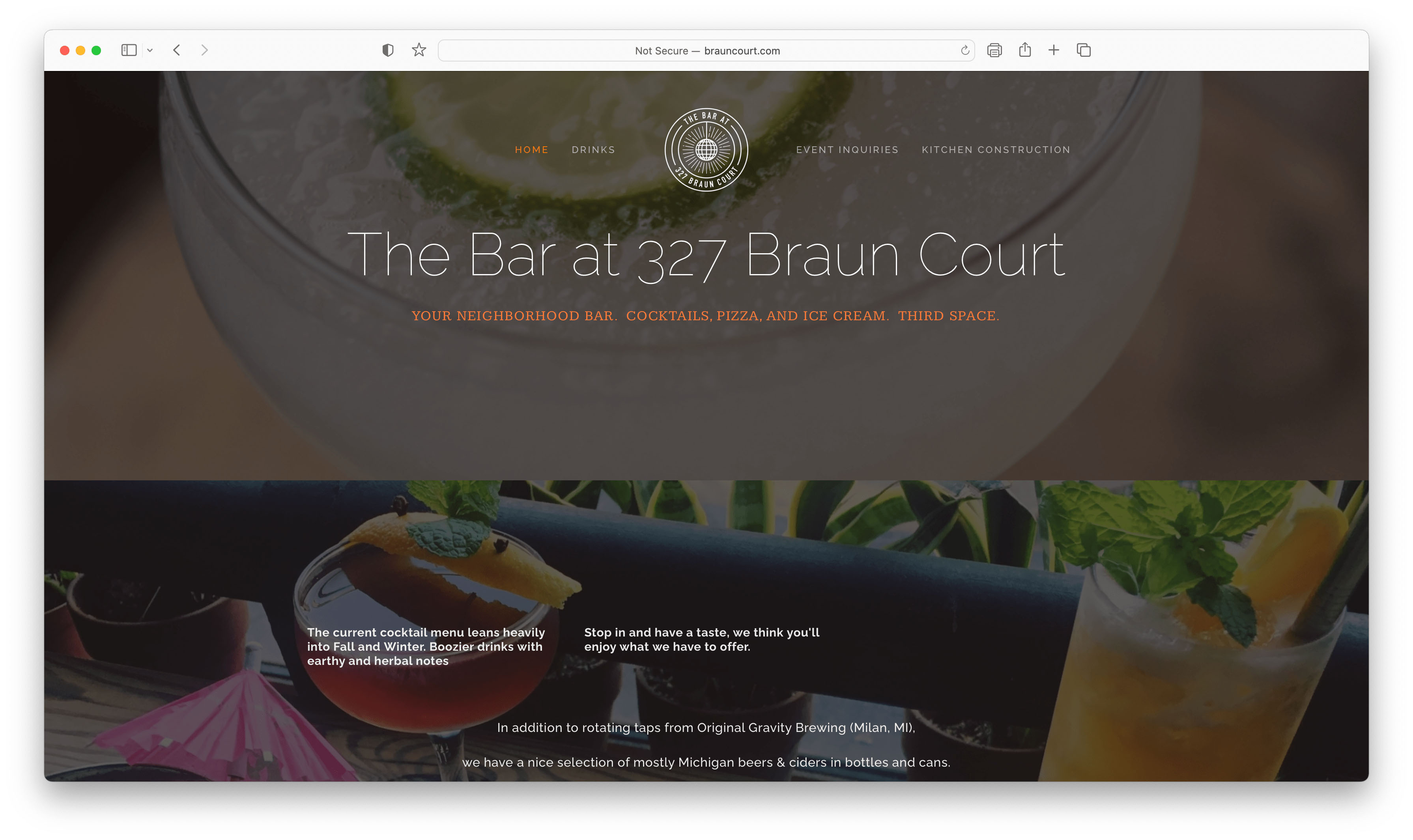
The Bar at 327 Braun Court is thought of as “Ann Arbor’s best kept secret” tucked away in Kerrytown. The goal of this redesign was to capture the eccentric vibe of the bar while highlighting this destination spot as a Third Space--a space that is not home, work or school--for its customers. The new website design also integrates a seamless online ordering experience to offer a new way to experience delicious food, cocktails, and desserts.
The Bar’s current website is not optimized to tell the location’s story, nor does it support the current need for online orders. The new website design focuses on giving customers an opportunity to quickly and easily view the current seasonal menu options from both mobile and desktop views and place an order for pickup at the bar through a modern and trendy design aesthetic.
The goal of my homepage design was to immediately capture the customer’s attention as soon as they land on the website. Using the principle of Aesthetic Usability Design, I used interesting imagery shots of the interior of the bar as well as product photos to show what the bar has to offer. I also used bold colors from a variety of the bar’s brand logos with a focus on red, grey, and white for strong contrast. The alternating cards with headings and buttons are designed to guide the user down a curated path of the homepage’s offerings, with an emphasis on the menu, online ordering, and events at the bar.
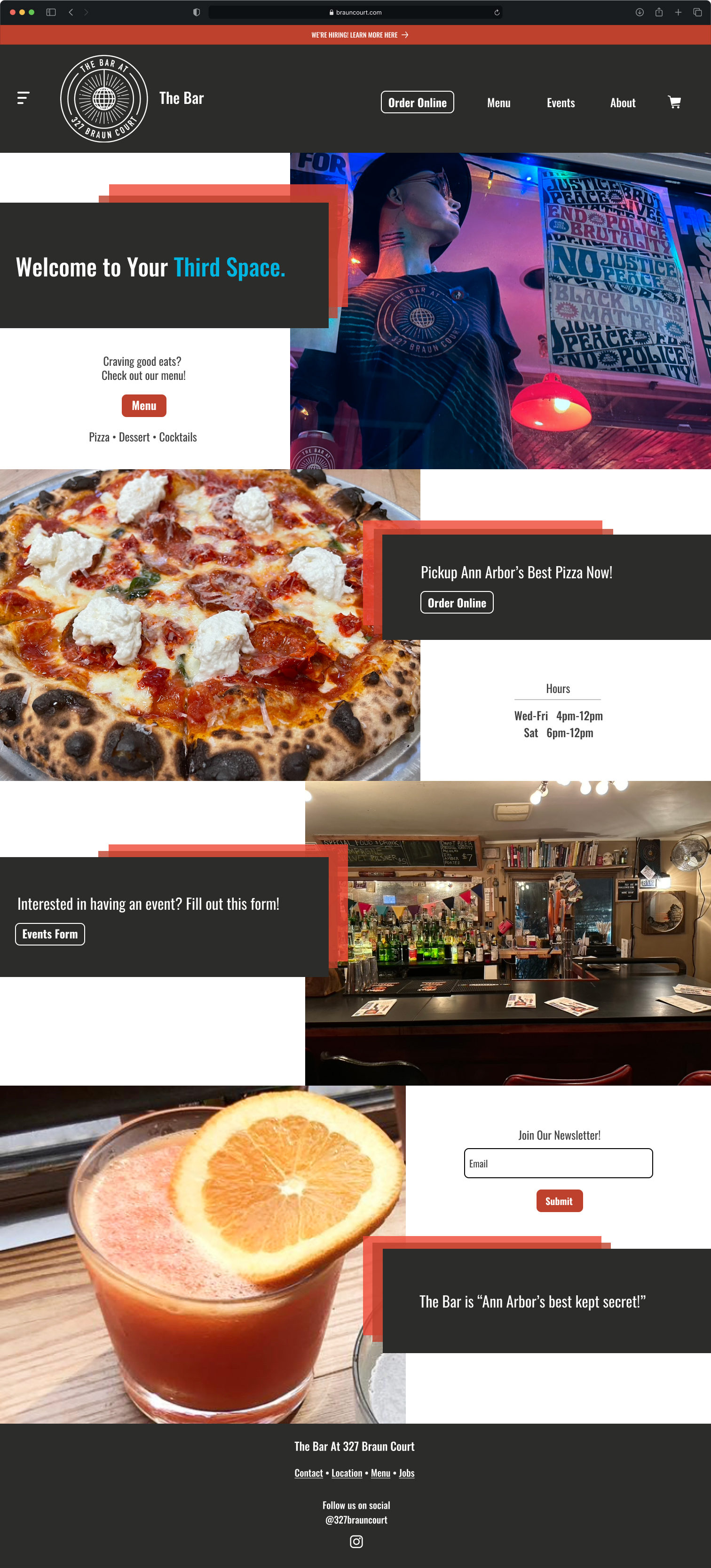
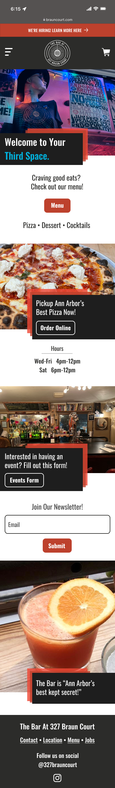
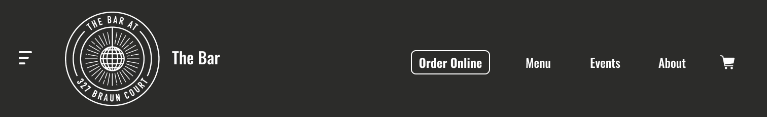
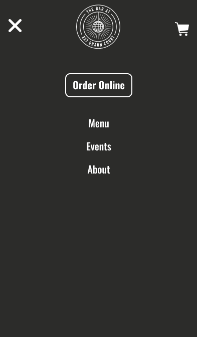
My intention with the new navigation design was to optimize the menu icon on both the mobile and desktop view. For the desktop navigation, there is a minimized view of the main site categories such as: Online Ordering, Menu, Events, and an About section. By clicking a category, a drop down of more options are displayed. The mobile version of the navigation features the same design concept that collapses down when a category is selected. This navigation creates a clearer organization structure that makes it easy for customers to find what they need quickly.
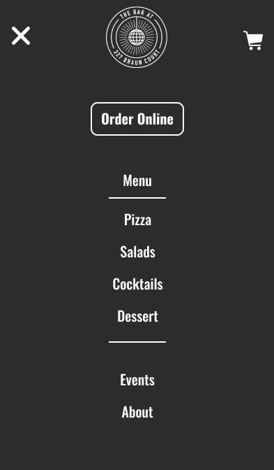
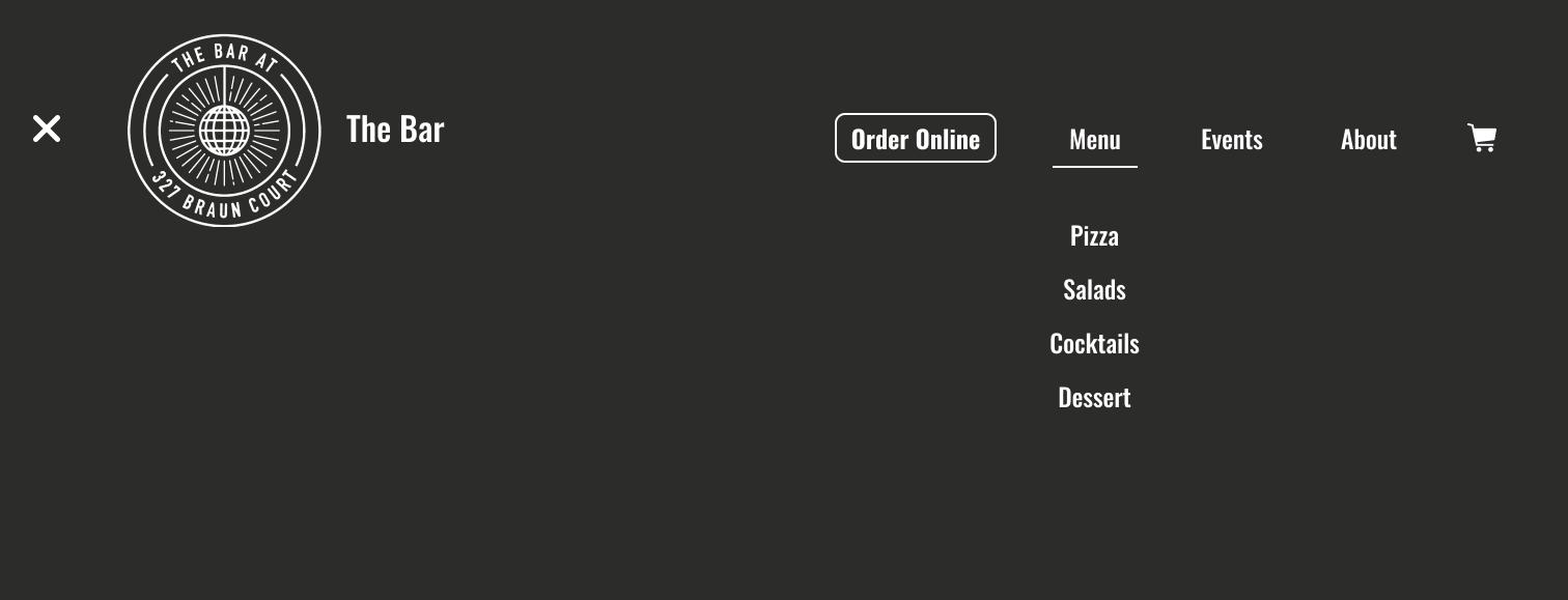
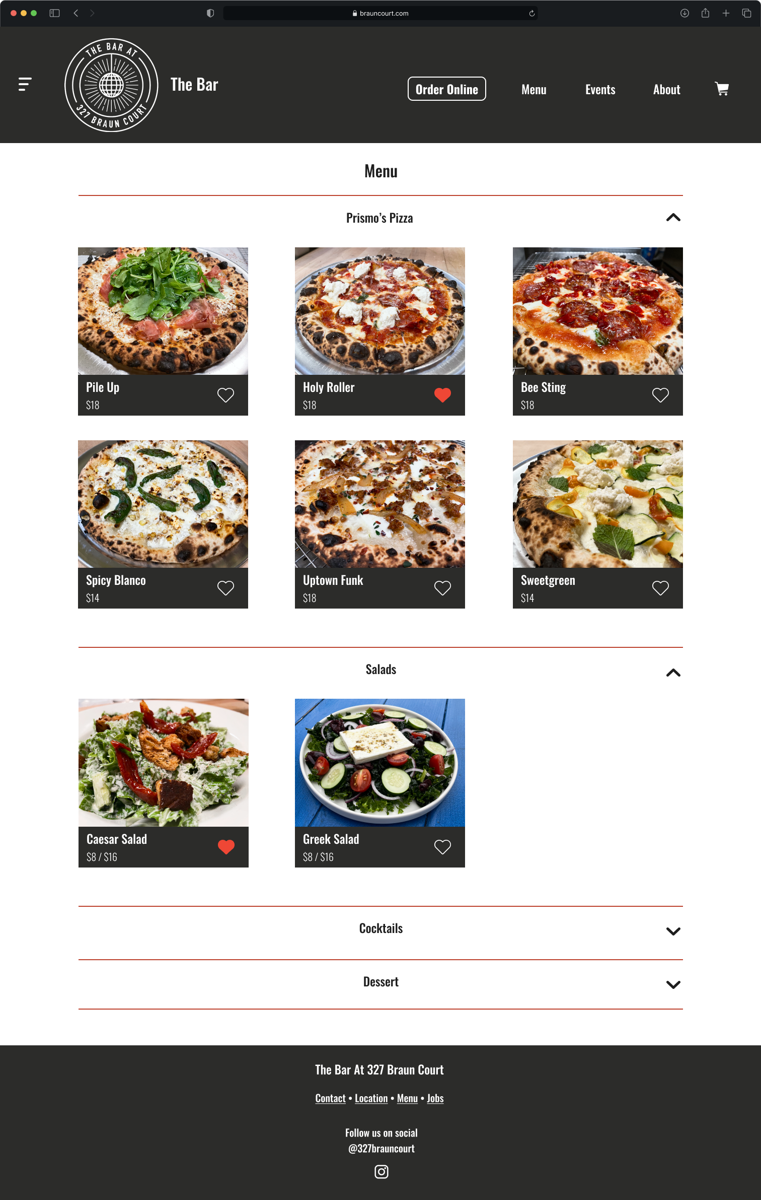
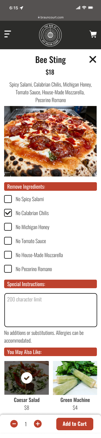
For my product page, I used Miller’s Law to chunk information for a more digestible layout design. I sorted the products by category of Pizza, Salads, Cocktails, and Desserts and I placed them in collapsible accordion dropdown components to allow the user to control how much information they see at one time. For the product details pop-up, the selections are chunked by sections: Remove Ingredients, Special Instructions, and You May Also Like to guide the user through any customizations or additional orders.
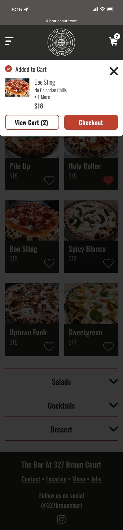
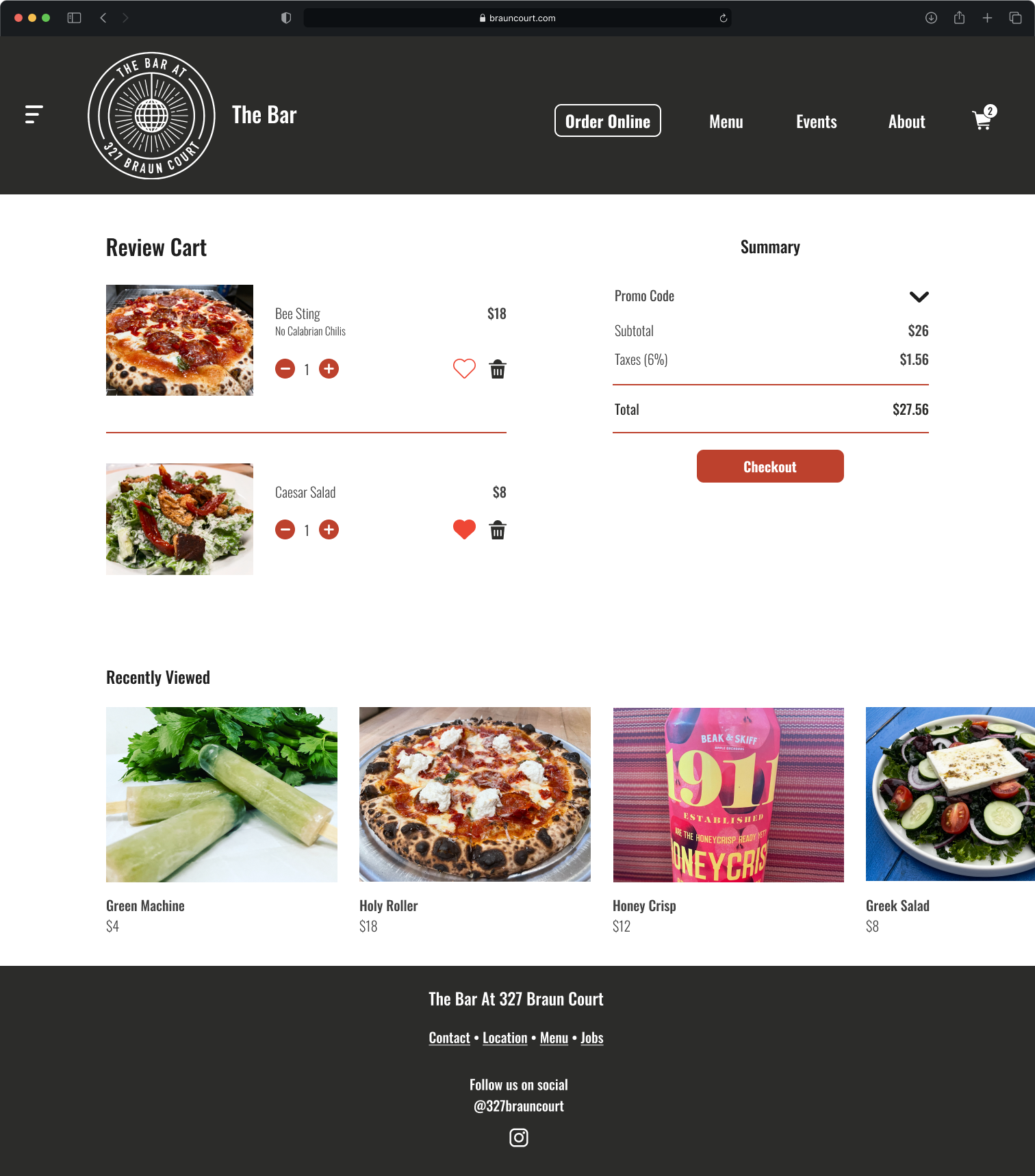
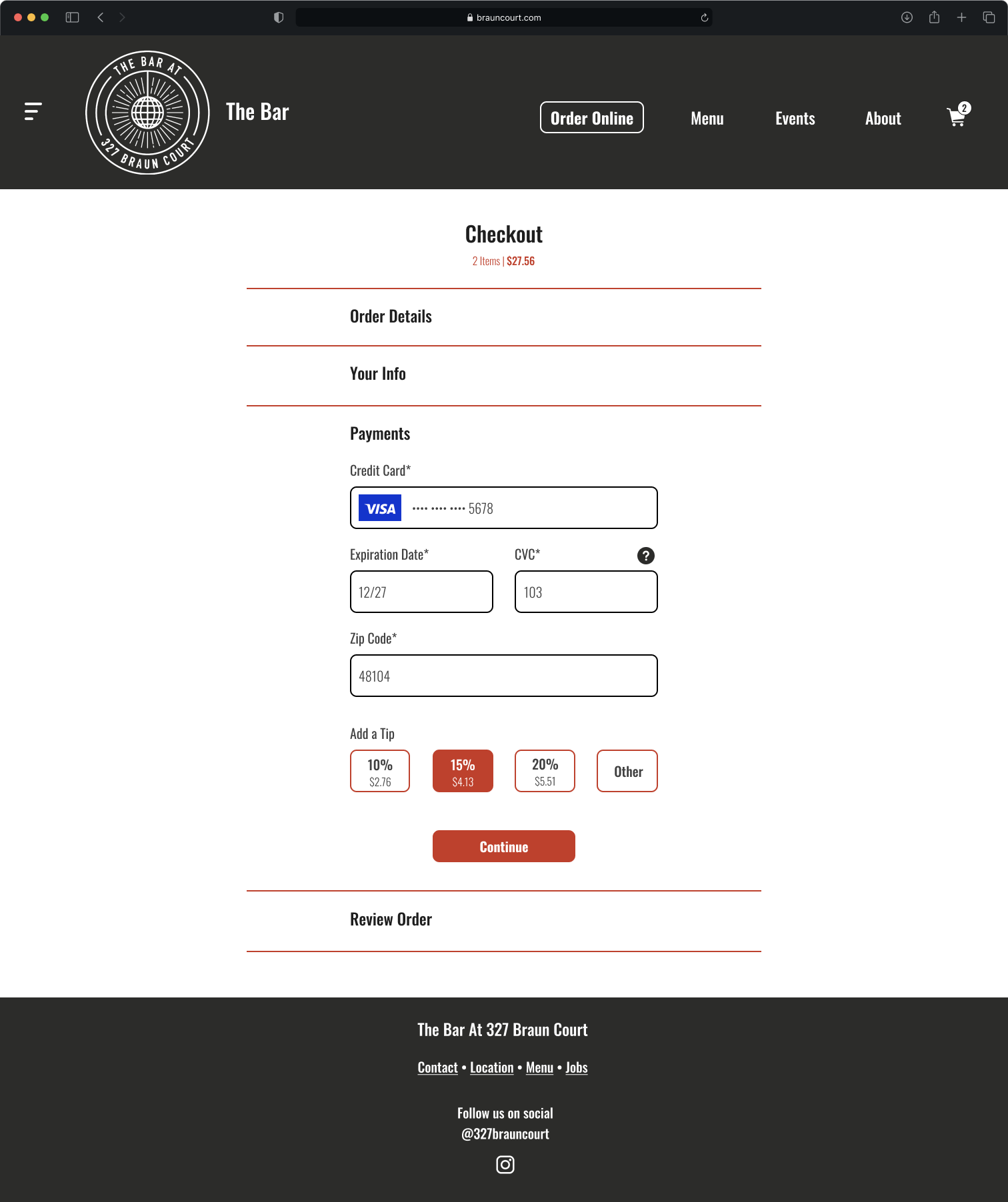
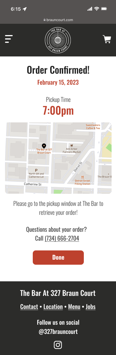
The client expressed interest in optimizing the website redesign for an online ordering checkout experience. The goal of the cart was to allow easy review of the items being purchased. In the cart experience, the customer is able to edit item quantities, save an item for later or remove it from the cart, and also see any recently viewed items they may want to consider. The checkout page gives the customer a total at the top of the page and takes them through the following steps: Order Details, Your Info, Payments, and Review Order. Once the order is completed, the customer is taken to an order confirmation page that gives them a pickup time and a map visual directing them where to go for pickup. There is also a number for customers to call if they have any problems with their order.